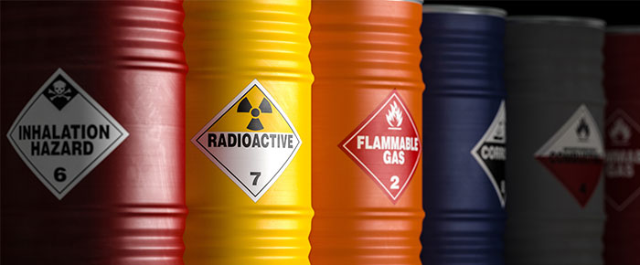
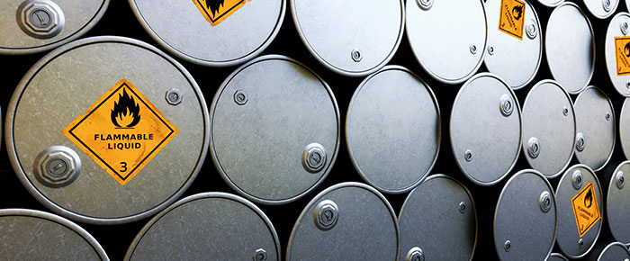
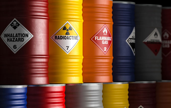
 Warning labels and signs are an essential part of most industrial sectors, from the automotive industry to construction and oil and gas; wherever there is a potential hazard, warning signs should be made available to notify personnel of potential dangers. Designing clear and reliable warning signs requires a good amount of consideration for various factors that can affect the reliability of your signs to prevent work accidents from occurring.
Label material
The type of label used to create warning and caution signs is as important as the text. It’s essential to consider the environment where the sign will be placed, as this will determine what kind of label is necessary. There are several different features that can help decide what type of label is most suitable, including:
- Weather resistance: Weather resistance is one of the most common requirements for industrial labels. This is especially true of warning signs and labels used outdoors, around power lines, or on construction sites. These labels must remain legible and affixed to their surface, even during periods of strong winds, rain, or intense heat.
- Chemical resistance: Chemical exposure represents an important hazard for many industrial sectors, from toluene to turpentine, oil, and corrosive solvents. However, it’s not enough to simply label a hazard; it’s necessary to ensure that the warning sign remains intact even if there is a splash or a spill.
- Abrasion: Most labels, after some time, will experience abrasion, especially those that are manipulated often, like stock items or equipment. Warning labels used for these should be inherently abrasion-resistant to ensure they are not ripped off or damaged over time.
Printout
Like the label material, the printout is essential to providing long-term readability for your warning labels. There are two main categories of printing methods:
- Thermal: Thermal printers are generally divided into thermal-transfer and direct thermal. Both utilize rolls of labels; whereas thermal-transfer printers apply ink from a ribbon using heat, direct thermal printers use a heated printhead to generate a printout on special labels coated with a dye. Though direct thermal printers (including DYMO printers) are cheaper, we recommend thermal-transfer printers for most applications, including warning labels, as they provide a sturdy printout that is resistant to nearly all environmental obstacles. Note that most direct thermal printouts are also unsuitable for heat-based applications, as the printout will turn black upon exposure to high temperatures.
- Digital: Digital printers include laser and inkjet. Laser printers are recommended for printing warning labels over inkjet, as they provide more stability and resistance against abrasion, smudging, and fading. They are also compatible with more types of labels than inkjet printers. However, neither type of digital printing method is resistant against exposure to harsh industrial solvents.
- Pre-Printed: While not a printing method, most label manufacturers can also provide pre-printed warning labels. Standard warning labels are available for most common hazardous environments, while custom warning labels can also be produced on-demand with your specific information, including text and graphics. This allows the labels to be used immediately without needing to print them first.
 Regulatory requirements
Before designing warning labels and signs, it’s worth consulting regulatory agencies, like the Occupational Safety and Health Administration (OSHA), the International Organization for Standardization (ISO), and the American National Standards Institute (ANSI). These agencies provide clear guidance on the specifications of warning labels, as well as how to use them. They even offer helpful definitions for the kinds of warning tags you can create, from caution and danger signs to biological hazard tags.
Text and symbols
For warning labels to be effective, they must be legible, first and foremost. To ensure legibility, bigger fonts and less text must be employed so that personnel can read the sign quickly and clearly understand the specifics of the warning. Symbols used to convey warnings should also be positioned as the main components of any warning sign; they should be visible from a distance and employed per their specific regulatory requirement.
Color
Using appropriate colors is crucial to capture workers’ attention and ensure they are continually aware of the dangers around them. Using bright, contrasting colors is the best way to catch someone’s eye, but it’s also important to use specific colors for certain types of hazards. For instance, it’s best to stick to red to denote the most severe warnings; orange and yellow represent decreasing risks, while green can be used for signs depicting areas that have other appreciably lower or no risks. When deciding on text color, ensure that it contrasts well with the sign’s background color (e.g., use white text on a deep red sign, similar to how a stop sign is designed). Again, refer to the National and International standards for creating warning signs if required or when in doubt.
Location
It’s essential to plan ahead when creating warning labels so you can judge where the label or tag will be needed. Ideally, the label should be in a location where personnel can clearly view it prior to working in or around the hazard. Remember, the surface where the label is to be placed must also be considered in conjunction with the type of label. Some labels are more adept at sticking to metal than others, while some locations may be directly exposed to chemicals or harsh weather.


